Casestudy
The one-stop app for live events,
from idea to MVP in less than 6 weeks.
Client
How the story started
It's the summer of 2021, and after a year of being pent-up at home during lockdown, millennials are frothing at the bit to get back to what they love:
Festivals.
At the same time, founders Ed Vincent & Stephan Bernede are frothing at the bit to provide said millennials with a much, much better way of buying festival tickets:
FestivalPass.
The idea's simple:
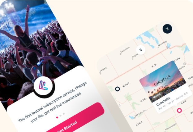
Every month, get FestivalPass credits with a $19-$99 subscription. Spend said credits on the coolest live events in the US - UMF, Coachella, Dallas Cowboy games - at a special price you wouldn't get anywhere else, without hitting refresh for 6 hours on TicketMaster or paying through the nose for ticket fees. You'd also see who's going to what so you can hook up for ride-sharing, drinks and afterparties.
That was their idea. But it was just that - an idea.
That was their idea. But it was just that - an idea.


With the industry forecasting the first huge wave of events kicking off in Q3 and Q4, now was the perfect time to turn that idea into reality. They had the experience, the vision, and a dev team raring to go… now all they needed was the design to make it happen. And that's when they got in touch with DesignMatch.
Don't spook the squirrel
A squirrel sees a bag of chips on the ground. Maybe there's something inside, maybe there isn't. The prospect of a huge reward draws him in, but the newness scares him away.
This was the design nut FestivalPass had to crack.
Everyone knows that buying tickets online is a ball-ache, but it's familiar and feels safe. FestivalPass solved the ball-ache part and then some, but was a way of attending events no-one had seen before, causing fear.
Meaning…


7 Seconds Would Make or Break FestivalPass
Your app only has 7 seconds to make a good first impression. Do it right, and you've won yourself a customer. Get it wrong? And your prospect never comes back. For FestivalPass, these 7 seconds would be everything. The design had to be exciting enough to draw them in, yet familiar enough to not scare the squirrel away.
The Matching Criteria


(1) A millennial mind reader
who knew what made the target market tick.
(2) Zero-to-one project management chops
as FestivalPass needed a designer to take charge and build from the ground up.
(3) Consumer app design
to make FestivalPass's new consumer journey feel safe
The Match
We matched FestivalPass with two designers: a passionate product designer with decades of design experience leading millennial-focused B2C projects, and a creative interface designer whose forte was turning complex ideas into screens simple enough for six year-olds to use.
Time to hire

How the Designers did it

Fine-tuning the message for millennials
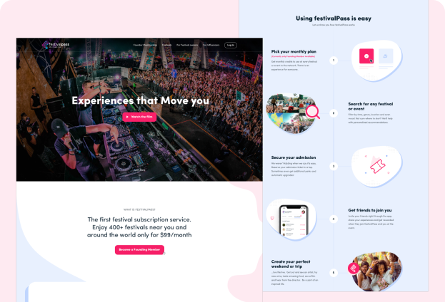
You might think FestivalPass's value prop was convenience. For one monthly fee, one app gives you access to all the events you want, at the lowest prices, doing away with ticket-hunting and fees.
But for the millennial target market, convenience wasn't king - experiences were. This shaped the app & web design, above all for those first crucial 7 seconds.
Making FestivalPass familiar
To give FestivalPass a familiar “feel”, the creative interface designer built the app and website in a style millennials see day in day out with brands they're already using.
Saving runway with modular design
As FestivalPass hadn't found PMF yet, the design had to be flexible. (For early stage-startups, an app that takes 3 weeks to change will kill your runway). So, the designers built “modular”, allowing the whole app to be tweaked in a few clicks to jive with market research.
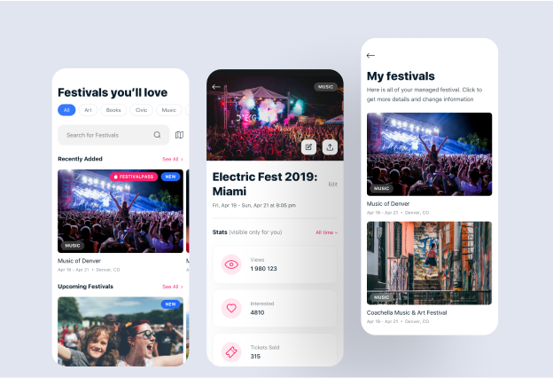
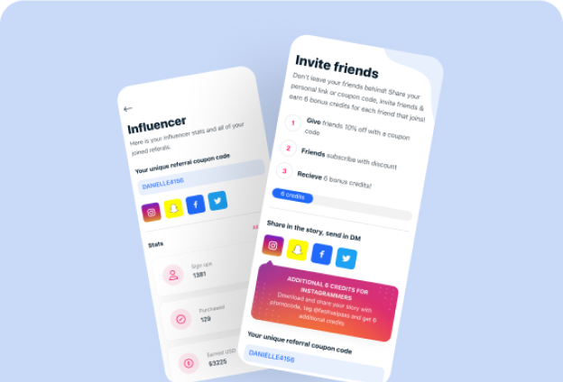
The visuals
What the design achieved
(in less than 4 months)
45k pre-launch sign ups
With an experienced-focused pre-launch landing page, FestivalPass was able to sign up close to 50,000 members, giving them that all-important social proof for their crowdfunding campaign.

MVP in less than 6 weeks
The designers built a visually-stunning interactive prototype to take to investors and get the devs busy.

Crowd-funded $76,594
With the visuals, the pre-launch sign-ups and an interactive prototype, Ed and Stephan launched a week-long StartEngine campaign and were able to raise $76,594 in seed funding, allowing them to take.
Where they are now

Monthly visits

Monthly growth.

Valuation

Ranked one of the top tech companies in Austin.
How much FestivalPass saved with Design Match

7 hrs
Reviewing
portfolios

4 hrs
Interviewing
candidates

9,2K USD
Paying
recruiters

1,6K USD
National payment compliance
A truly dreadful idea?

Hit the blue button
(it almost never bites)

Type in your goal
MVP, PMF, pitch deck, you name it

Get a shortlist of A-list designers to get you there
in 2 minutes most
Zero commitment, and it won't cost a peso.