Table of Contents:
- Gestalt Principles in Design: The Secret Sauce for Visual Appeal
- Figure/Ground Relationship: The Key to Balanced Design
- Experience-Based Principle: Balancing Design Concepts for Impactful User Experiences
- Law of Similarity in Web Design Applications
- Focal Points In Design: The Key to User Engagement
- FAQs in Relation to Gestalt Principles
Picture this scenario: you’re a startup founder eager to make your mark in the world with an innovative product or service. You’ve got everything figured out – except for one crucial aspect: design.
Enter Gestalt principles, a powerful psychological framework that can revolutionize your design and user experience approach. By understanding these fundamental principles, you’ll be able to create visually appealing and effective designs that resonate with users on a deeper level.
We will delve into this fascinating topic by exploring the foundations of Gestalt psychology and its significance in contemporary design. We’ll examine key concepts such as figure/ground relationships, uniform connectedness, experience-based principles, the law of similarity in web design applications, and focal points in design – all through the lens of Gestalt principles.
So buckle up and prepare for an insightful journey into the fascinating world of Gestalt theory!
Gestalt Principles in Design: The Secret Sauce for Visual Appeal
Let’s dive right in, shall we?
Gestalt principles are your best friend when it comes to designing visually stunning experiences for website and app users. Originating from gestalt psychology, these rules help you simplify complex information into clear, ordered designs while providing enough context for the eye to fill in any gaps. And guess what? They’re essential for understanding visual perception.
Origins of Gestalt Psychology: A Quick History Lesson
So where did this all begin?
Gestalt psychology emerged in the early 20th century as a response to structuralism – an approach that focused on breaking down mental processes into their most basic elements. The gestalt psychologists, however, believed that human perception is more than just the sum of its parts. And thus, gestalt principles were born.
Importance of Gestalt Principles in Design: Why You Should Care
- They make your design look clean and organized by grouping related elements together.
- Your users will thank you. Organizing elements to improve user experience can make content simpler to comprehend and navigate, boosting the appeal of your design in comparison with others.
- You’ll stand out from competitors with visually appealing designs that capture attention and drive engagement.
Early and mid-stage startup founders mainly between 26-49 can benefit from applying gestalt principles to their design elements. By using the similarity principle, individual elements can be grouped together to create a focal point. This helps to draw the user’s attention to the most important information on the page. Additionally, the closure principle can be used to create a sense of completeness and encourage users to explore more of the website or app.
Modern design and UI design rely heavily on visual hierarchy, which is another fundamental principle of gestalt psychology. By using size, color, and placement, designers can create a clear hierarchy of information that guides the user through the content in a logical and intuitive way.
So, whether you’re designing a website, app, or any other type of digital experience, gestalt principles should be at the forefront of your mind. By understanding these psychological principles and applying them to your design, you can create visually stunning experiences that are both easy to use and engaging for your users.
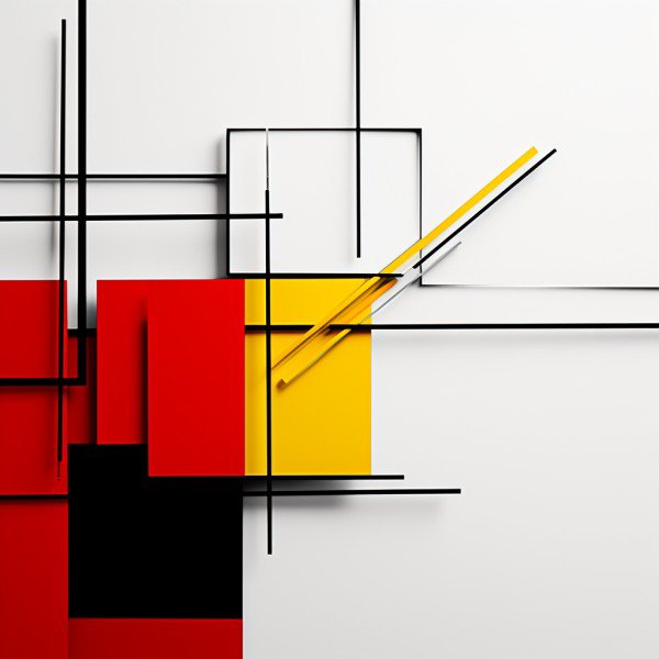
Figure/Ground Relationship: The Key to Balanced Design
To create visually appealing designs, it’s crucial to understand the figure/ground relationship – a fundamental concept within gestalt principles.
Let me break it down for you:
Understanding Positive Elements and Negative Space
The “figure” refers to positive elements or objects in your design, while the “ground” represents negative space surrounding those elements.
A harmonious balance between these two aspects is essential for an effective and aesthetically pleasing layout.
Examples of Effective Figure/Ground Relationships
Consider this classic example: Rubin’s vase illusion, where a vase (figure) and two faces (ground) coexist simultaneously due to clever use of negative space.
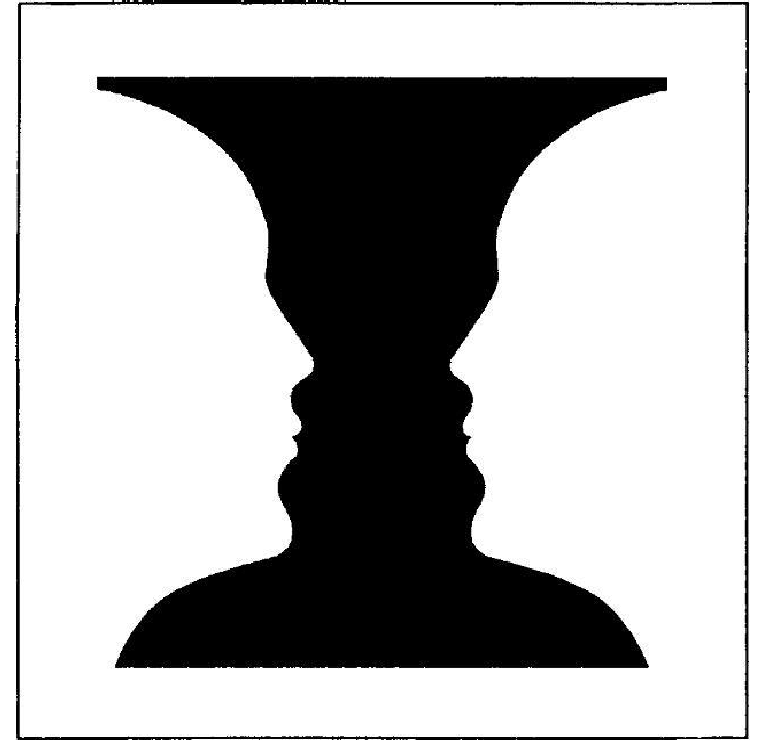
In web design, striking the right balance can make your content more accessible and engaging for users by guiding their eyes through different sections effortlessly.
Now that we’ve covered the basics, let me share some practical tips on achieving an effective figure/ground relationship in your designs:
- Create clear distinctions between figures and ground using contrasting colors or shapes. This helps viewers quickly identify important information without feeling overwhelmed by cluttered visuals.
- Maintain consistency throughout your design. If certain elements are consistently treated as figures across multiple pages or screens, users will have an easier time navigating your site/app.
- Don’t be afraid to play with negative space. Sometimes, less is more. Create a layout that’s visually pleasing and straightforward by leaving ample space between your design elements.
Eager for more design tips? Check out our blog for insights on various design principles and techniques.
Now that we’ve mastered figure/ground relationships, let’s explore another essential gestalt principle: uniform connectedness.
Stay tuned.
Uniform Connectedness: The Key to Cohesive Design
Let’s talk about uniform connectedness.
This powerful gestalt principle can make or break your design layout by influencing how users perceive the relationships between elements on a page.
The Importance of Connection in Design Layouts
Imagine you’re browsing an app and come across two buttons that look identical, but they perform different actions. Frustrating, right? To avoid this confusion, designers must establish clear connections between related elements using visual cues like lines, colors, or shapes – all thanks to our friend uniform connectedness.
Practical Examples Showcasing Uniform Connectedness
- A navigation menu: Use consistent colors, fonts, and styles to create a cohesive look and feel. This helps users easily identify where they are on your site and how to navigate to other pages.
- Contact forms: Use similar shapes and colors for related fields, such as name and email. This helps users quickly identify which fields they need to fill out and how to submit the form.
By using uniform connectedness, you can create a modern design that is both visually appealing and easy to use. This psychological principle is a fundamental principle of gestalt theory and gestalt psychology, and is one of the gestalt laws that govern how we perceive individual elements as part of a larger whole. By establishing a clear focal point and using the similarity principle and closure principle, you can create a visual hierarchy that guides users through your design elements and helps them achieve their goals.
Experience-Based Principle: Balancing Design Concepts for Impactful User Experiences
The experience-based principle is often overshadowed by its more popular siblings – similarity and proximity.
But hey, don’t underestimate its power when it comes to creating delightful user experiences.
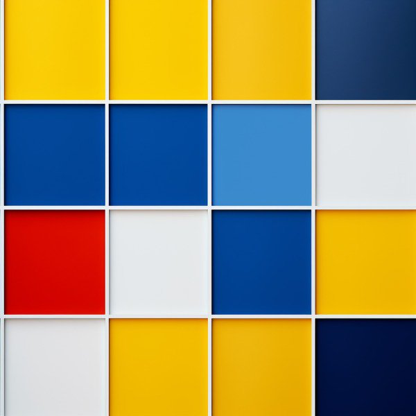
Law of Similarity in Web Design Applications
Alright, let’s dive into the fascinating world of Gestalt principles.
One key principle to master is the law of similarity, which can significantly impact your web design.
To make it simple and actionable, we’ll focus on link systems and color schemes.
Implementing the Law of Similarity in Web Design
First up: links.
Your website should have a consistent link system across all pages, ensuring users easily understand their purpose and functionality.
Distinct colors for links are essential to avoid confusion with other interactive features on your site or app.
Examples of Effective Link Systems and Color Schemes
- Example 1: A clean layout with blue underlined text as hyperlinks – easy to spot without being overwhelming.
- Example 2: An innovative design where bright yellow buttons contrast against a dark background, making them stand out as clickable elements.
Remember that breaking away from established patterns based on similarity can also be beneficial at times.
Deviating from the norm can draw attention to specific content pieces, creating a unique user experience.
In conclusion, applying the law of similarity in web design is crucial for providing an intuitive and visually appealing interface for your users.
By implementing consistent link systems and color schemes, you’ll ensure a smooth browsing experience while effectively guiding users through your site or app.
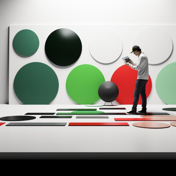
Focal Points In Design: The Key to User Engagement
Before we explore the magical world of focal points, it’s crucial to understand their importance in design and how they can boost user engagement on your website or app.
Ready? Let’s go.
Importance of Focal Points for User Engagement
Focal points are like visual magnets that draw users’ attention towards specific elements within a design.
An effective focal point ensures important information is easily accessible and understood by users, ultimately enhancing their experience with your product.
Gestalt principles, anyone?
Strategies for Establishing Effective Focal Points
- Contrast: Use contrasting colors or shapes to make essential elements stand out from the rest. Think bright call-to-action buttons.
- Hierarchy: Organize content based on its significance using size, position, color – you name it. This helps guide users through your layout intuitively.
- Motion: Movement captures attention – consider incorporating subtle animations or transitions into your design. But remember: less is more.
- Negative Space: Give vital components room to breathe by surrounding them with ample negative space. Ita€™s all about striking a balance between clutter and clarity.
Incorporating these strategies will not only create visually appealing designs but also help users navigate your product with ease, ultimately leading to a better overall experience.
Pro tip: Don’t forget to analyze user behavior and iterate on your design accordingly. User feedback is gold.
So there you have it – the secret sauce for creating captivating focal points in design that will keep users engaged and coming back for more.
You’re now ready to apply these strategies and watch your website or app transform into an attention-grabbing masterpiece.
FAQs in Relation to Gestalt Principles
What are some examples of Gestalt principles in real life?
In real life, Gestalt principles can be observed in various contexts such as traffic signs, company logos, and user interfaces. For instance, the Olympic rings represent proximity and similarity; the FedEx logo demonstrates closure with its hidden arrow; and a well-organized website showcases uniform connectedness through consistent layout and design elements.
What is the main idea behind Gestalt principles?
The main idea behind Gestalt principles is that humans perceive visual stimuli as organized patterns or wholes rather than individual parts. These principles help designers create visually appealing and effective designs by guiding how users interpret visual information based on their innate cognitive processes.
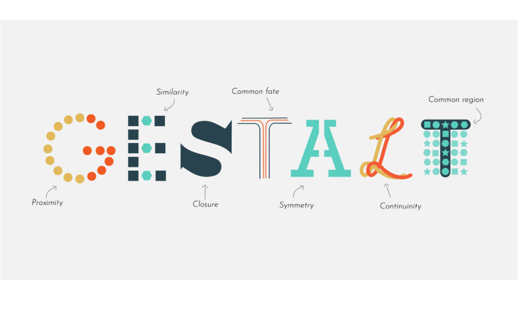
What are the 5 Gestalt principles?
The five core Gestalt principles include:
- Proximity: Objects close together are perceived as related
- Similarity: Similar objects tend to be grouped together
- Closure: Incomplete shapes or lines are mentally filled in to form whole figures
- Symmetry & Order: Balanced compositions appear more stable and aesthetically pleasing
- Figure/Ground Relationship: The mind separates foreground from background elements
What is an example of a Gestalt principle applied in design?
An example of a Gestalt principle applied in design would be using color similarity to group navigation menu items on a website. By applying similar colors for all menu items, users can easily recognize them as part of one functional group while differentiating them from other page content.